
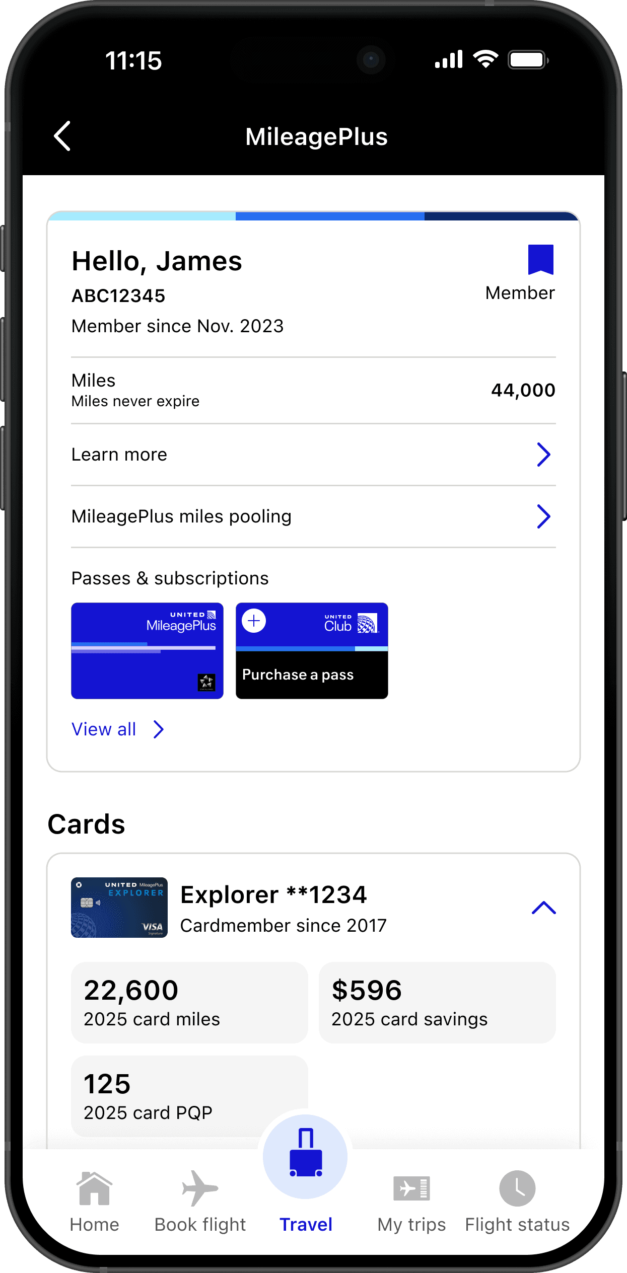
United Airlines: Travel Mode
A feature design for United's mobile app for the day of travel. The work consolidated flight tracking, connection guidance, and arrival information into one proactive, contextual experience. Shipped on iOS and Android in Jan 2026.

ROLE
TYPE
Mobile App
The Challenge
A fragmented experience at the most stressful moment
United Airlines needed to transform their mobile app for the day of travel — the critical moment when travelers are most anxious. The existing experience was fragmented, forcing users to jump between multiple screens and apps to find essential information.
Fragmented information
App abandonment
High stress touchpoints
No proactive guidance
DESIGN PROCESS
Mixed-method research to uncover real traveler needs
Early user interviews and session recordings made one thing clear: the product was getting in the way of the process. Sales reps spent more time navigating tabs and buried actions than engaging with leads. Critical information, like contact history or deal status, was scattered across screens, often hidden behind dropdowns or modals. There was no clear hierarchy, and task flows required too many steps for even the most basic actions. This created friction, slowed productivity, and led users to rely on external spreadsheets and workarounds.
Key design decisions
Progressive disclosure of information
Clear visual hierarchy with status indicators
Contextual content that adapts to travel phase
Moved boarding time near gate info (based on user feedback)
Added "last updated" timestamps for trust
Redesigning with Intent
Context is key. What you need, when you need it.
I began by mapping the most frequent workflows and identifying friction points at each step. From there, we focused on removing barriers—eliminating unnecessary clicks, surfacing essential data, and streamlining how users moved through lead and pipeline views.
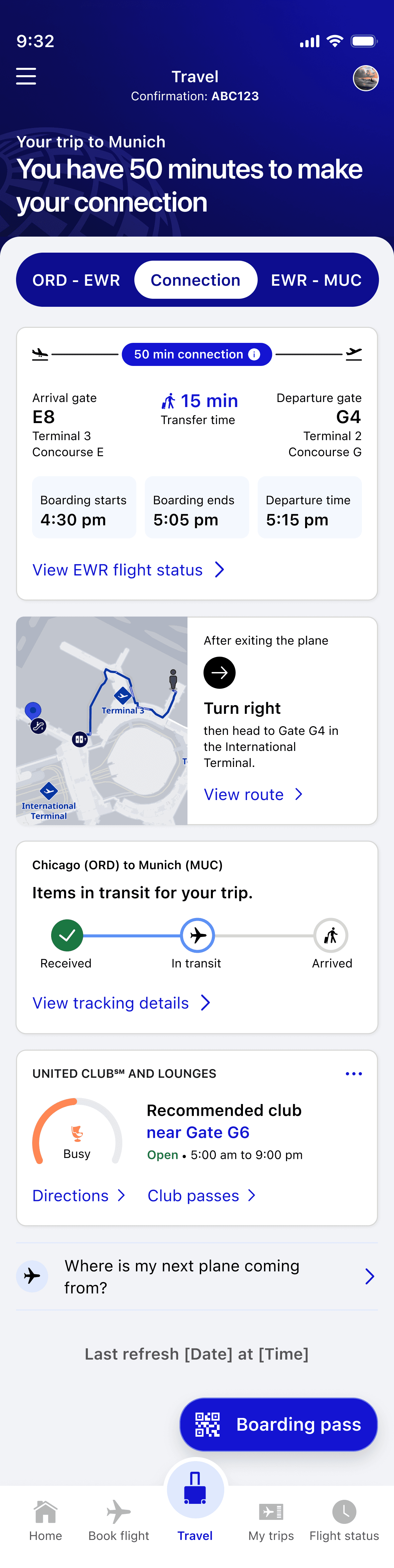
ORD - EWR
Connection
EWR - MUC
We created a secondary navigation, in which users could gain insight into relevant information at heach stage of their journey, where that was a direct flight, or one with multiple connections.
Helping travelers orient at
unfamiliar airports.
1. Welcome message with terminal
2. Baggage claim info and carousel number
3. Rideshare availability and wait times
4. Terminal guide access
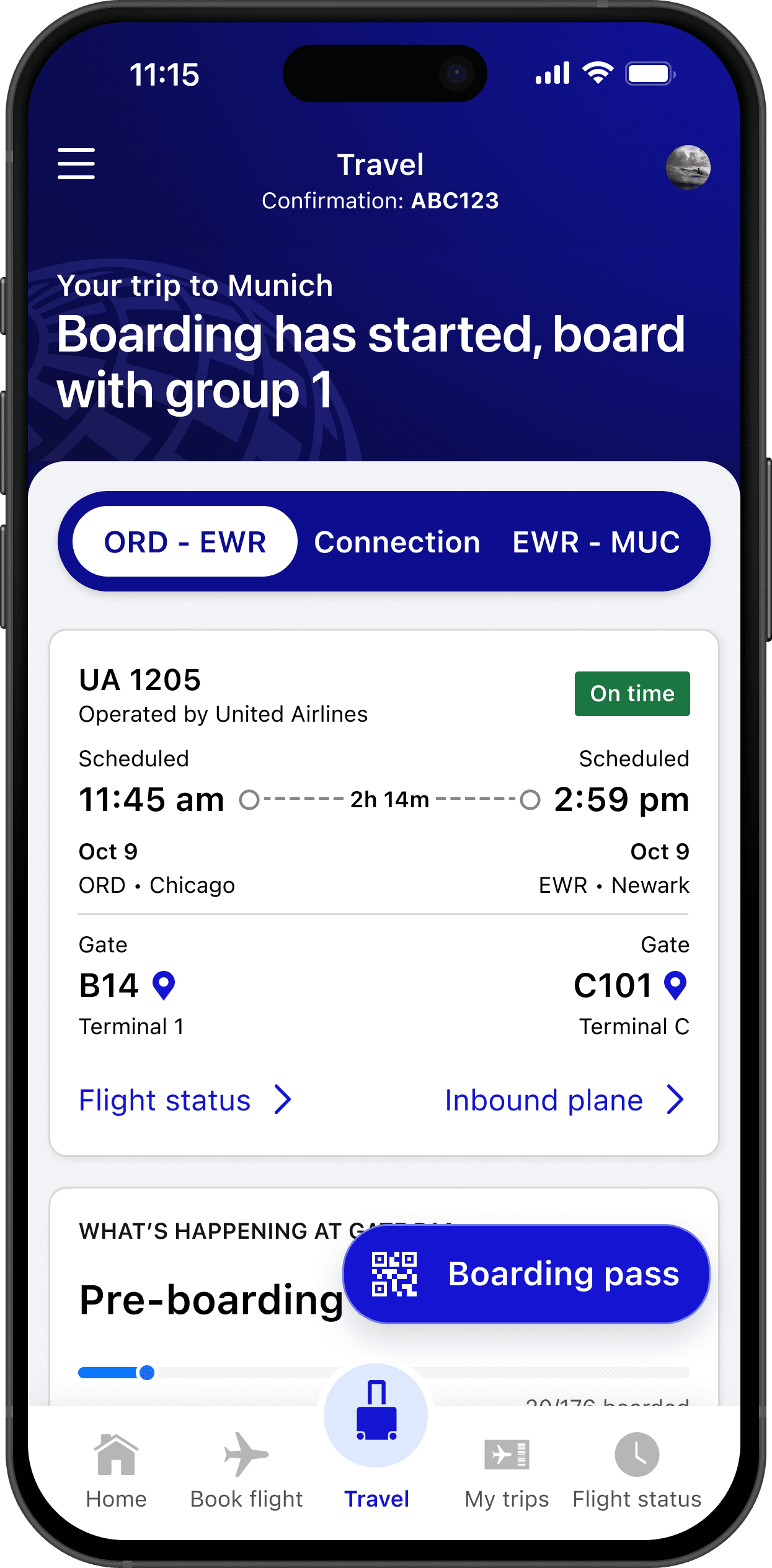

Designing the flight block:
scannable, layered, trustworthy
As lead designer on the flight block, I focused on progressive disclosure, showing essential info first with deeper details one tap away. Visual hierarchy uses size, weight, and color to guide attention.
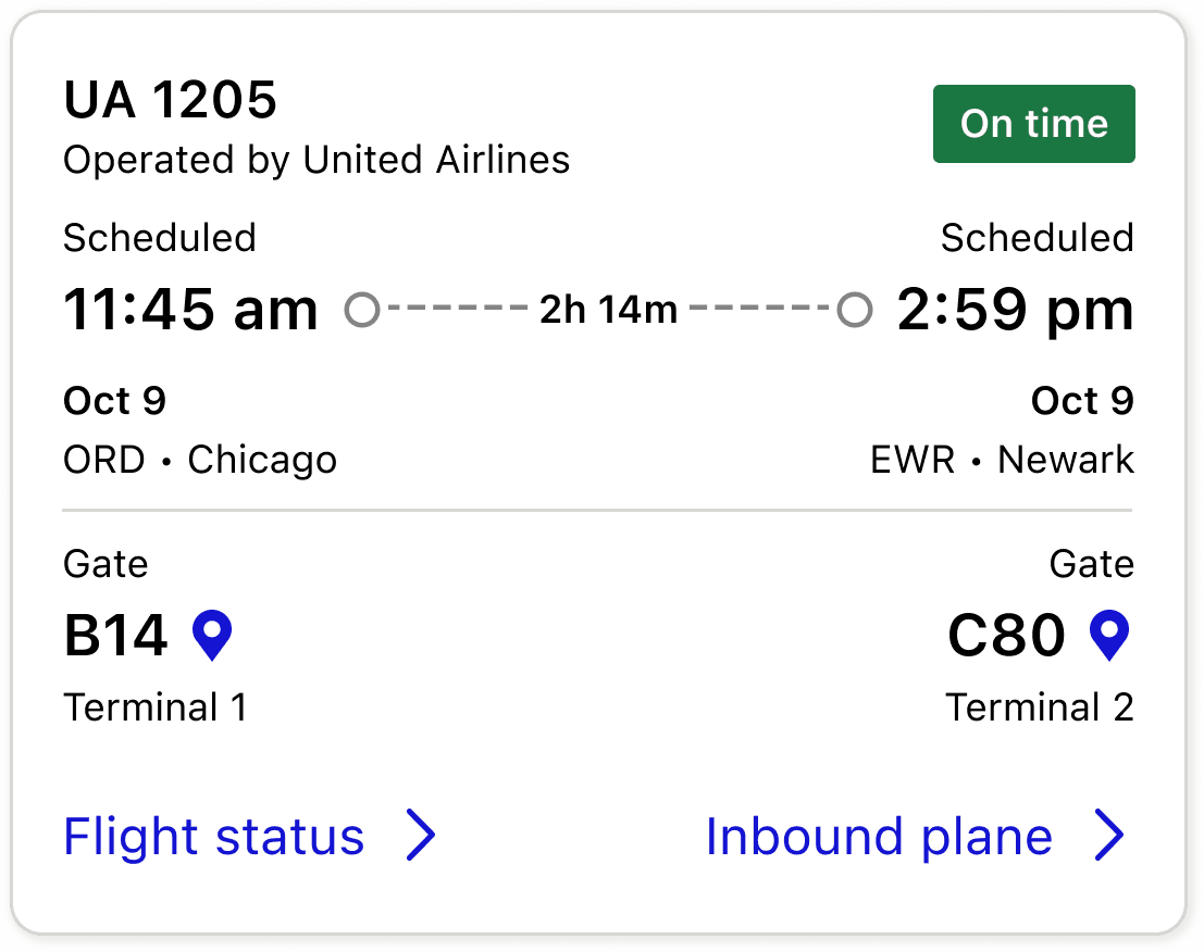
Increased visibility of departure and arrival gate
Status badge of your flight
Condensed info
Reduced secondary clutter by 40%
Arrival Card Component

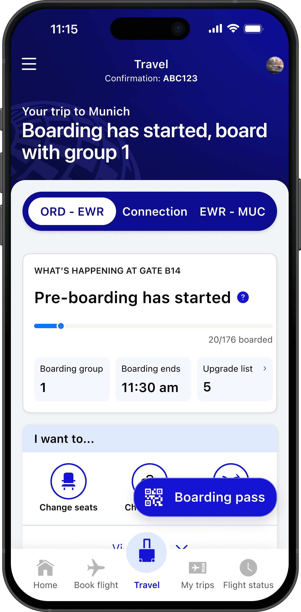
design challenges
Mixed pre/post information: 8/12 users confused when pre-boarding and arrival info appeared togetherClear visual hierarchy with status indicators
Buried baggage claim: 12/20 users wanted this information more prominent
solutions
Created clear separation between "What's Happening at Gate" and "Arrival in [City]" sections
Elevated baggage claim information in visual hierarchy
Added quick action buttons for common tasks
Incorporated map preview for baggage claim location
Connection guidance that provides real reassurance
Interactive map showing current location and next gate, walking time estimates, step-by-step directions, and amenities along the route.
User Feedback
"The map and timing gave me strong reassurance"
Results & Impact
User Sentiment
User Satisfaction & Usability Success
4.97/5
user confidence rating during testing
73%
approval
for 3-category navigation structure
96%
for enhanced MVP design
90%
task success rate
in unmoderated testing
4.92/5
average task completion confidence
92%
preferred
information-rich default view
Where we landed
When stress is high, comprehensive information builds confidence, but only when it's organized with clear hierarchy. The question isn't how little can we show. It's what serves this person right now. Travel Mode is the working answer for one specific moment, but the principle extends: technology earns its place by respecting the person using it, not by demanding their attention.